Waterfall Plot
Table of Contents
⚠️ Make Sure You Understand the Code Before Using It ⚠️
Introduction
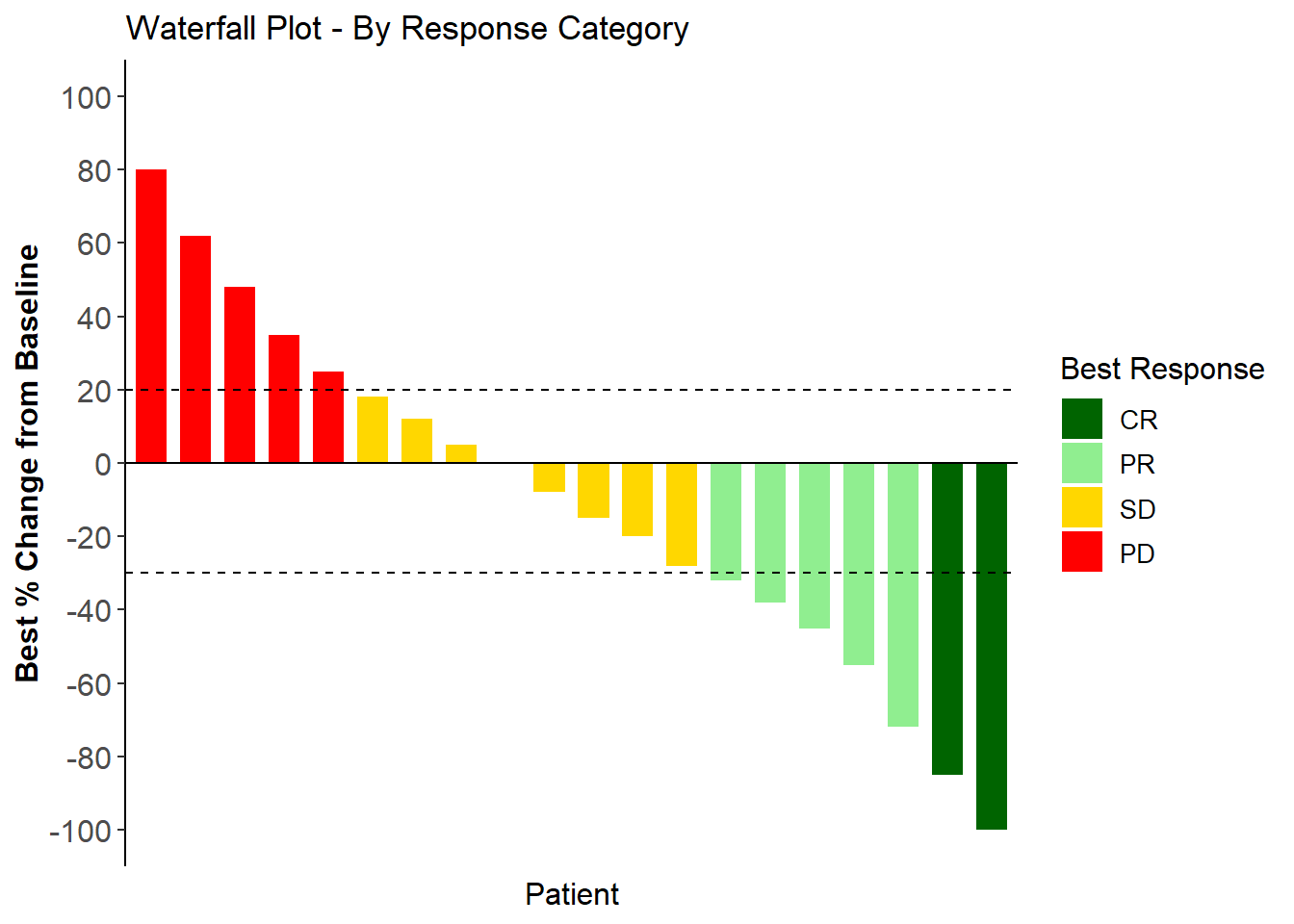
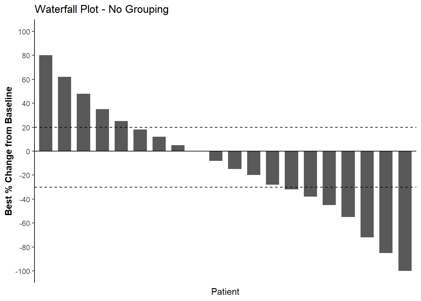
A function to generate a waterfall plot showing the best percentage change from baseline for each patient, commonly used to visualize tumor response in oncology trials. Bars are ordered from best response (most negative) to worst response (most positive), with optional coloring by response category or treatment arm.
Input
- Cleaned up patient-level data with one row per patient and required variables listed below:
- id_var: Patient ID column name (string)
- pct_change_var: Best percentage change from baseline column name (string)
- group_var: Optional grouping variable for bar colors (string, e.g., “response_category”, “treatment_arm”)
- reference_lines: Optional numeric vector for horizontal reference lines (e.g., c(-30, 20) for RECIST thresholds)
- title: Plot title (string)
- xlab: X-axis label (string)
- ylab: Y-axis label (string)
- ylim_cus: Y-axis limits (numeric vector, default c(-100, 100))
- y_breaks: Y-axis breaks (numeric vector, default seq(-100, 100, 10))
- color_palette: Optional named vector of colors for groups.
- legend_position: Legend position (numeric vector c(x, y) or string like “bottom”, “right”, “none”)
- legend_title: Legend title (string, default uses group_var name)
- legend_title_size: Legend title size (numeric)
- legend_text_size: Legend text size (numeric)
- axis_title_size: Axis label text size (numeric)
- axis_text_size: Axis ticks text size (numeric)
Output
- A ggplot2 object
Example Data
library(tidyverse)
## ── Attaching core tidyverse packages ──────────────────────── tidyverse 2.0.0 ──
## ✔ dplyr     1.1.4     ✔ readr     2.1.4
## ✔ forcats   1.0.0     ✔ stringr   1.5.1
## ✔ ggplot2   3.4.4     ✔ tibble    3.2.1
## ✔ lubridate 1.9.0     ✔ tidyr     1.3.1
## ✔ purrr     1.0.1
## ── Conflicts ────────────────────────────────────────── tidyverse_conflicts() ──
## ✖ dplyr::filter() masks stats::filter()
## ✖ dplyr::lag()    masks stats::lag()
## ℹ Use the conflicted package (<http://conflicted.r-lib.org/>) to force all conflicts to become errors
library(ggplot2)

example_data <- tribble(
  ~ID, ~best_pct_change, ~response_category, ~treatment_arm,
  "PT001", -100, "CR", "Arm A",
  "PT002", -85, "CR", "Arm B",
  "PT003", -72, "PR", "Arm A",
  "PT004", -55, "PR", "Arm B",
  "PT005", -45, "PR", "Arm A",
  "PT006", -38, "PR", "Arm B",
  "PT007", -32, "PR", "Arm A",
  "PT008", -28, "SD", "Arm B",
  "PT009", -20, "SD", "Arm A",
  "PT010", -15, "SD", "Arm B",
  "PT011", -8, "SD", "Arm A",
  "PT012", 0, "SD", "Arm B",
  "PT013", 5, "SD", "Arm A",
  "PT014", 12, "SD", "Arm B",
  "PT015", 18, "SD", "Arm A",
  "PT016", 25, "PD", "Arm B",
  "PT017", 35, "PD", "Arm A",
  "PT018", 48, "PD", "Arm B",
  "PT019", 62, "PD", "Arm A",
  "PT020", 80, "PD", "Arm B"
)

# Set factor levels for response category
example_data$response_category <- factor(
  example_data$response_category,
  levels = c("CR", "PR", "SD", "PD")
)
Function
WFplot <- function(
    data,
    pct_change_var,
    id_var = "ID",
    group_var = NULL,
    reference_lines = -30,
    title = NULL,
    xlab = "Patient",
    ylab = "Best % Change from Baseline",
    ylim_cus = c(-100, 100),
    y_breaks = seq(-100, 100, 10),
    color_palette = NULL,
    legend_position = NULL,
    legend_title = NULL,
    legend_title_size = NULL,
    legend_text_size = NULL,
    axis_text_size = NULL,
    axis_title_size = NULL
){

  # Filter out missing values
  data <- data %>%
    filter(!is.na(.data[[pct_change_var]]))

  # Create internal variables
  data$ID <- data[[id_var]]
  data$change <- data[[pct_change_var]]

  # Add group variable if provided
  if (!is.null(group_var)) {
    data$group <- data[[group_var]]
  }

  # Set legend title (use group_var if legend_title not provided)
  if (is.null(legend_title) & !is.null(group_var)) {
    legend_title <- group_var
  }

  # Base plot
  if (!is.null(group_var)) {
    b <- ggplot(data, aes(x = reorder(ID, -change), y = change, fill = group))
  } else {
    b <- ggplot(data, aes(x = reorder(ID, -change), y = change))
  }

  # Add bars
  b <- b +
    geom_bar(stat = "identity", width = 0.7, position = position_dodge(width = 0.4))

  # Add reference lines
  if (!is.null(reference_lines)) {
    for (ref in reference_lines) {
      b <- b + geom_hline(yintercept = ref, linetype = "dashed")
    }
  }

  # Add zero line
  b <- b + geom_hline(yintercept = 0, linetype = "solid")

  # Add labels and theme
  b <- b +
    labs(
      title = title,
      x = xlab,
      y = ylab,
      fill = legend_title
    ) +
    scale_y_continuous(breaks = y_breaks) +
    coord_cartesian(ylim = ylim_cus) +
    theme_classic() +
    theme(
      axis.line.x = element_blank(),
      axis.text.x = element_blank(),
      axis.ticks.x = element_blank(),
      axis.title.y = element_text(face = "bold", angle = 90)
    )

  # Add custom color palette if provided
  if (!is.null(group_var) & !is.null(color_palette)) {
    b <- b + scale_fill_manual(values = color_palette)
  }

  # Build theme modifications
  theme_mods <- list()

  if (!is.null(legend_position)) {
    theme_mods$legend.position <- legend_position
  }

  if (!is.null(legend_title_size)) {
    theme_mods$legend.title <- element_text(size = legend_title_size)
  }

  if (!is.null(legend_text_size)) {
    theme_mods$legend.text <- element_text(size = legend_text_size)
  }

  if (!is.null(axis_text_size)) {
    theme_mods$axis.text <- element_text(size = axis_text_size)
  }

  if (!is.null(axis_title_size)) {
    theme_mods$axis.title <- element_text(size = axis_title_size)
  }

  # Apply theme modifications if any
  if (length(theme_mods) > 0) {
    b <- b + do.call(theme, theme_mods)
  }

  return(b)
}
Plot WITH single arm
plot_no_group <- WFplot(
  data = example_data,
  pct_change_var = "best_pct_change",
  id_var = "ID",
  group_var = NULL,
  reference_lines = c(-30, 20),
  title = "Waterfall Plot - No Grouping",
  xlab = "Patient",
  ylab = "Best % Change from Baseline",
  ylim_cus = c(-100, 100),
  y_breaks = seq(-100, 100, 20),
  axis_text_size = 12,
  axis_title_size = 12
)
Plot WITH response category
plot_with_response <- WFplot(
  data = example_data,
  pct_change_var = "best_pct_change",
  id_var = "ID",
  group_var = "response_category",
  reference_lines = c(-30, 20),
  title = "Waterfall Plot - By Response Category",
  xlab = "Patient",
  ylab = "Best % Change from Baseline",
  ylim_cus = c(-100, 100),
  y_breaks = seq(-100, 100, 20),
  legend_title = "Best Response",
  legend_position = "right", # c(0.9,0.9)
  legend_title_size = 12,
  legend_text_size = 10,
  color_palette = c("CR" = "darkgreen", "PR" = "lightgreen", "SD" = "gold", "PD" = "red"),
  axis_text_size = 12,
  axis_title_size = 12
)